View Project
Mofu is a modern sauna brand that merges minimalist design with everyday functionality, offering stylish, high-quality saunas tailored to contemporary lifestyles. Rooted in craftsmanship and aesthetic clarity, the brand emphasizes comfort, personal expression, and a seamless connection to nature. From product to packaging, every touchpoint reflects Mofu’s dedication to quality and modern living.
Problem
Mofu needed a distinct and cohesive brand identity that communicated its values—contemporary design, sustainability, and premium comfort—while standing out in a competitive wellness and home-living market. The challenge was to visually convey this unique blend of style, function, and natural inspiration across all digital and physical channels.
Solution
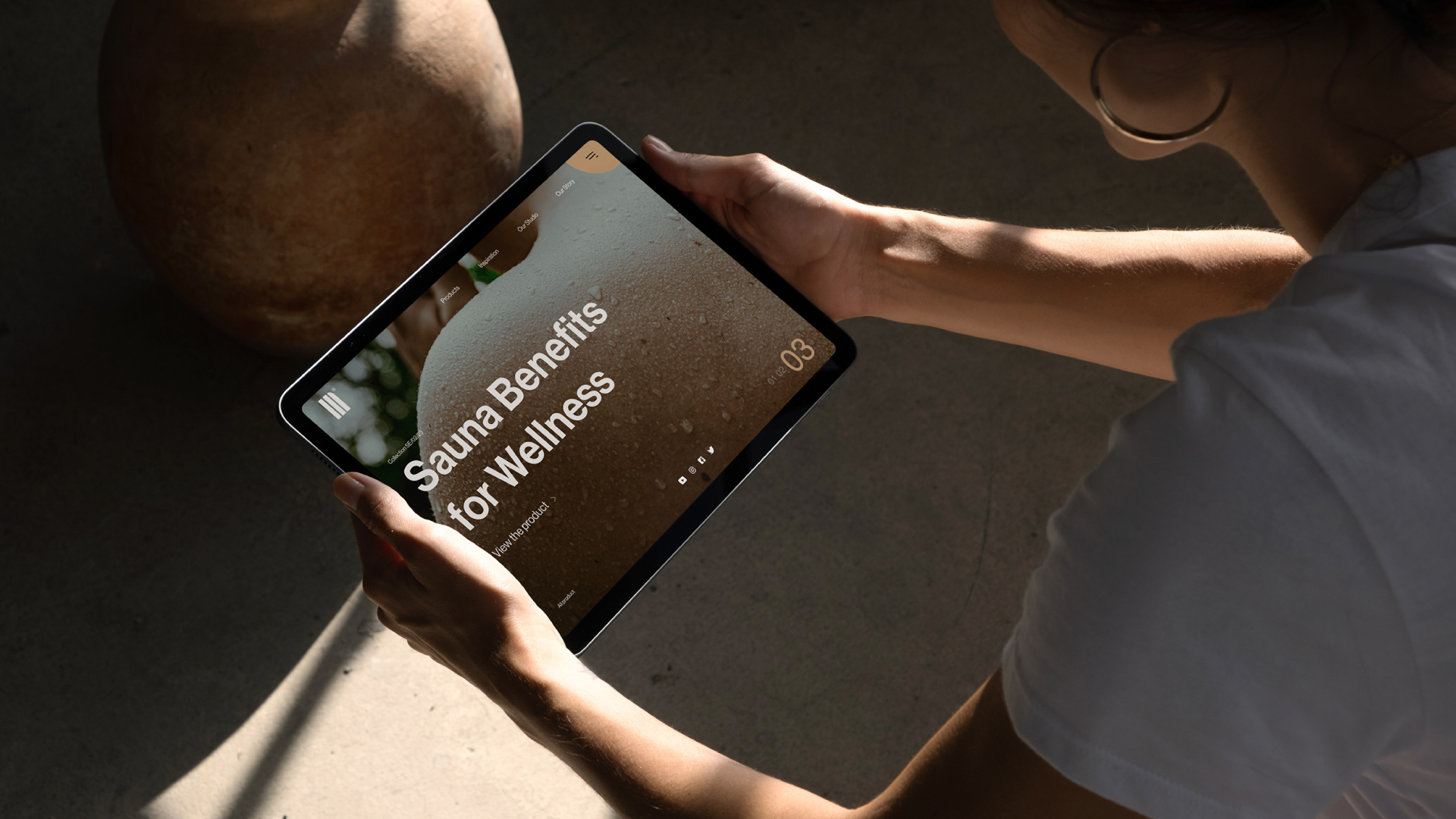
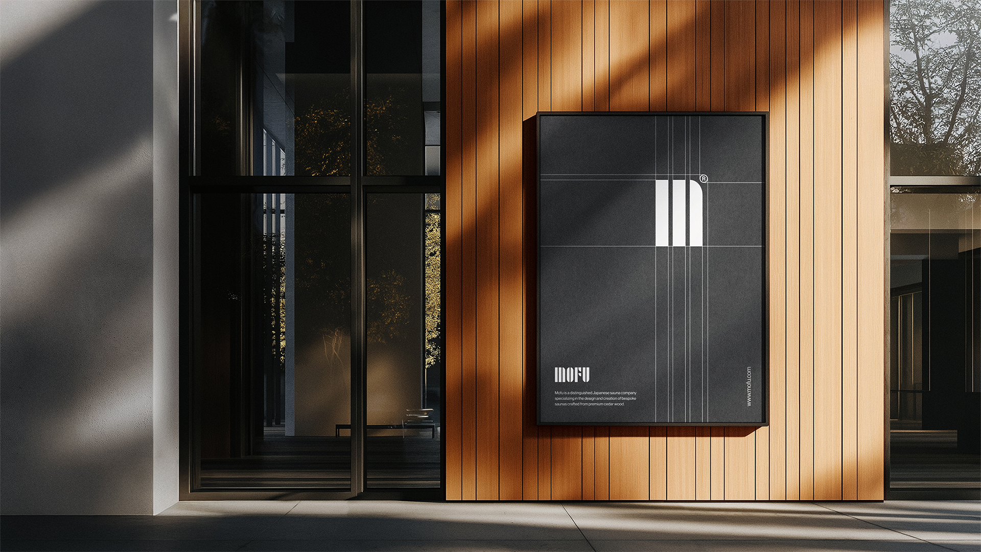
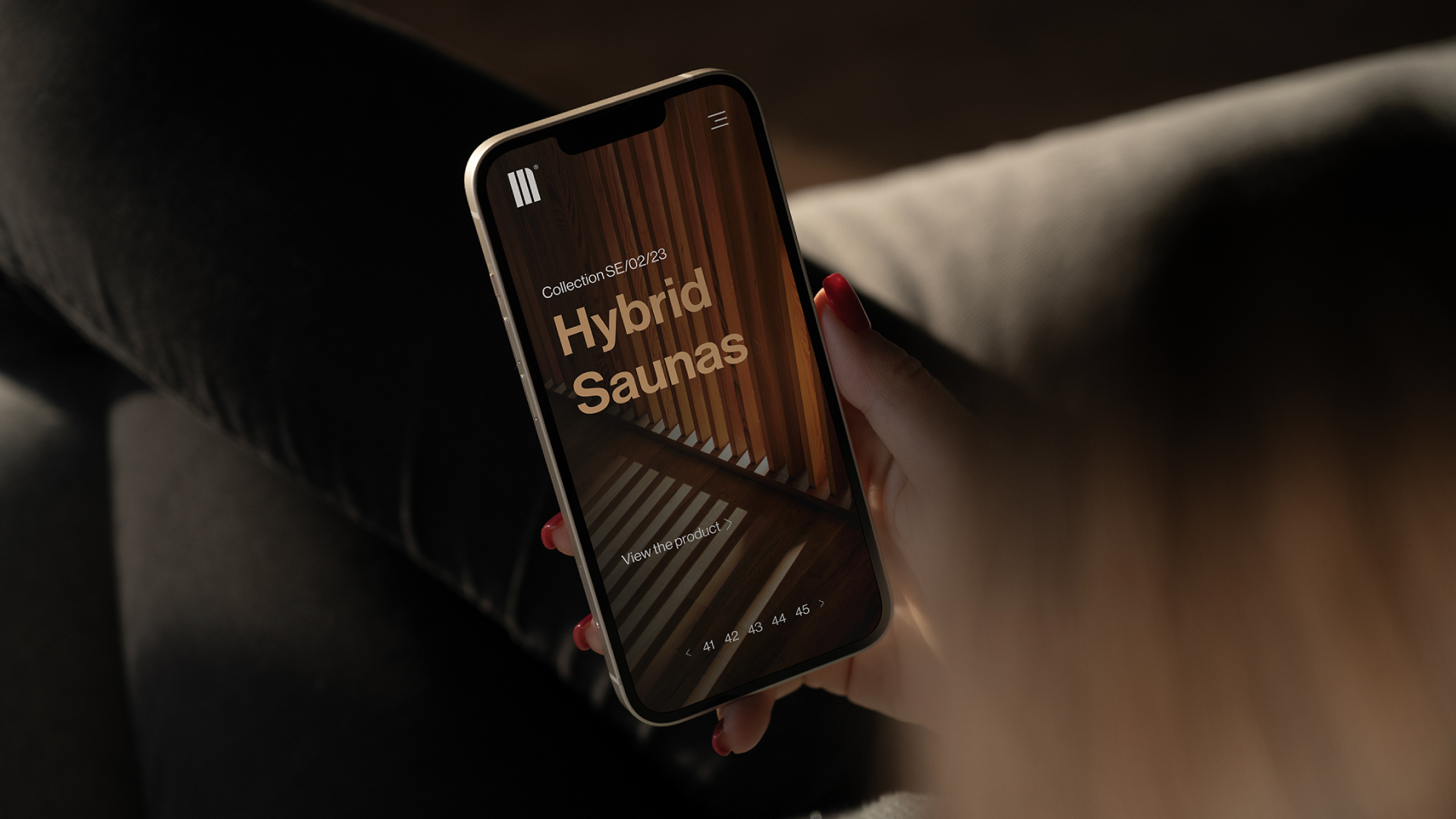
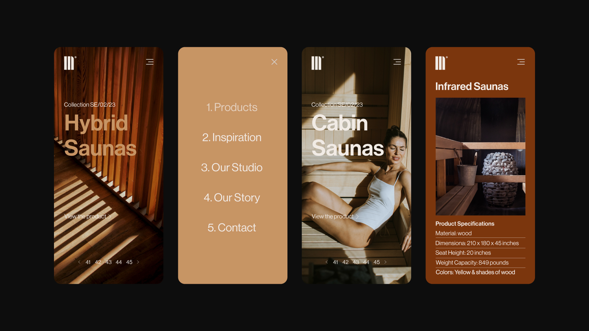
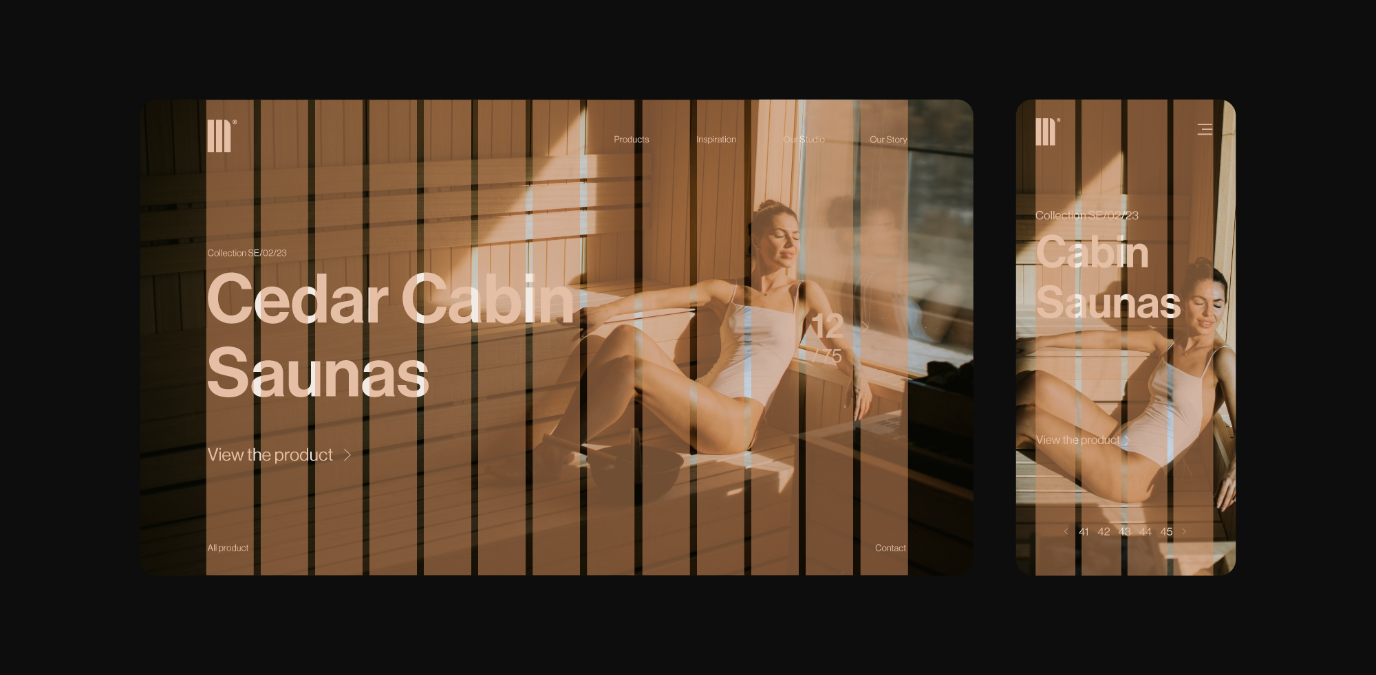
The identity was built around clarity and restraint. A refined wordmark and neutral typographic system established a calm, modern foundation, while a nature-inspired color palette and modular 32-field grid brought structure and consistency across digital and physical applications. The system was applied across the website, brand assets, and packaging, supported by understated lifestyle photography and practical mockups. The result is a cohesive visual language that feels considered, functional, and aligned with Mofu’s emphasis on craftsmanship and everyday use.
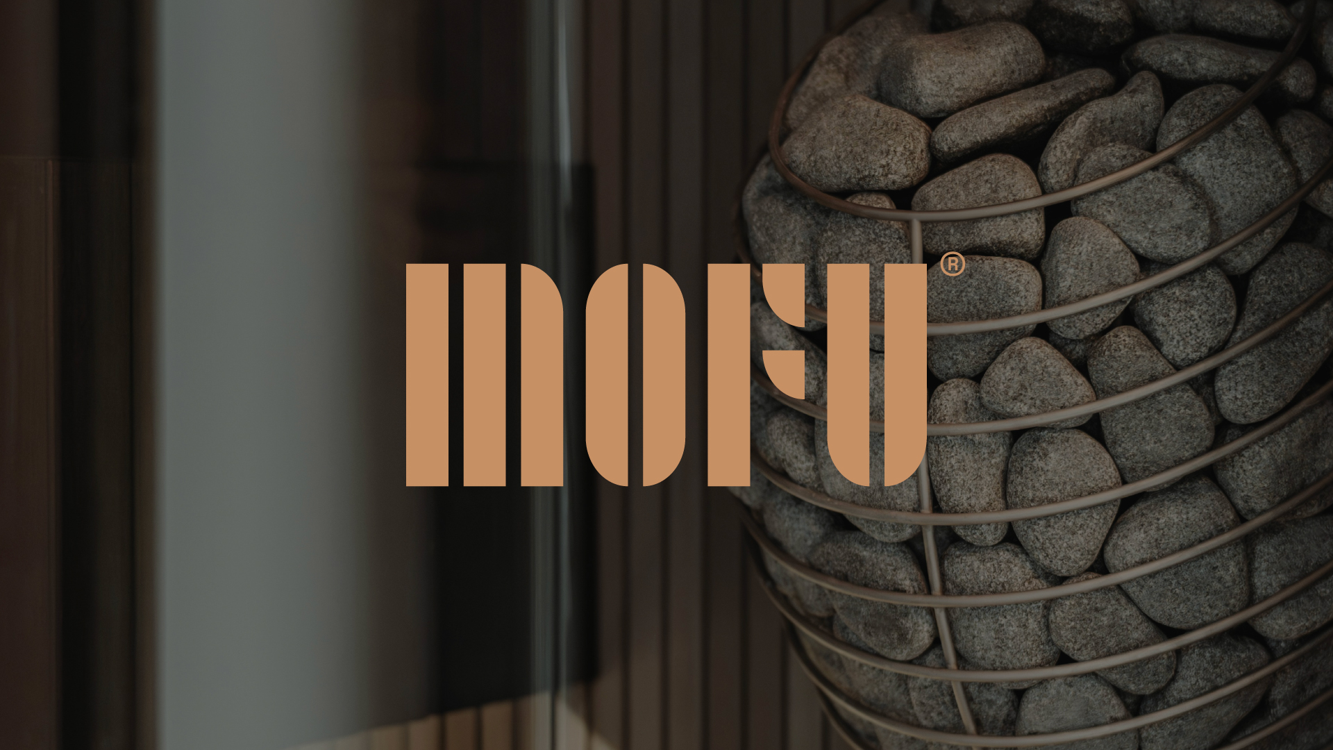
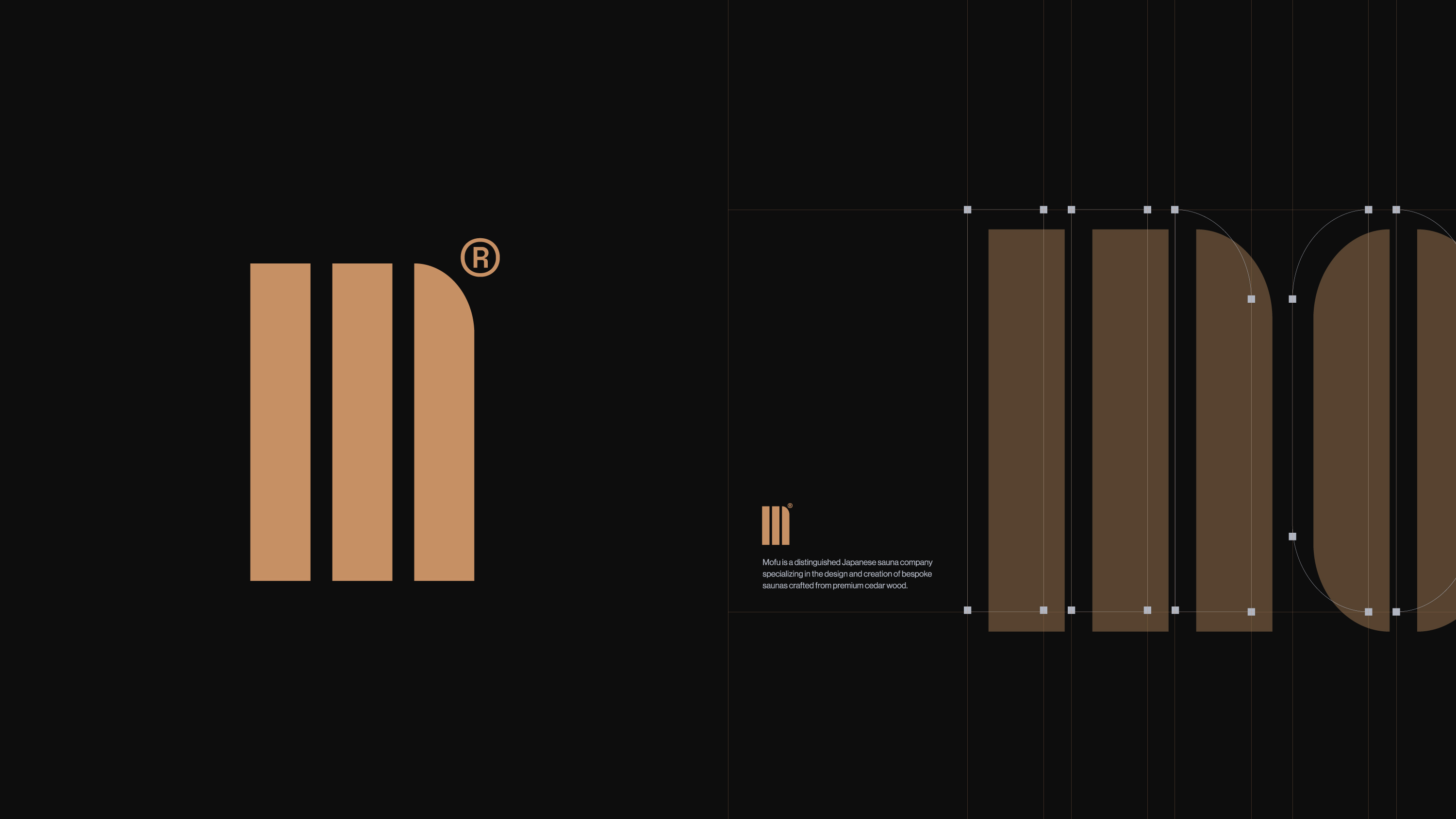
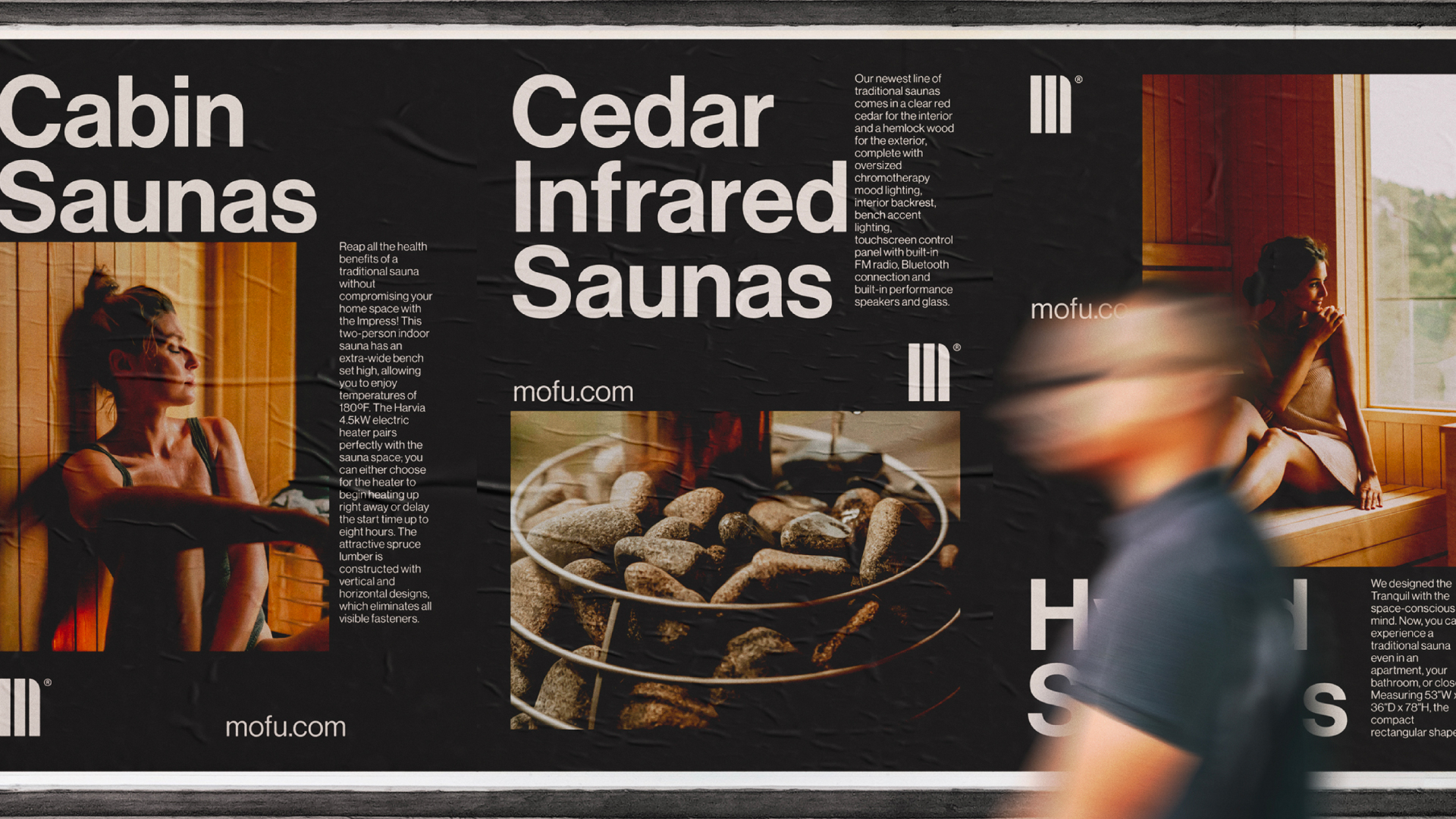
The visual identity was derived from the interior structure of Mofu’s saunas, where the repetition of wood planks creates a calm, linear rhythm. This pattern became a foundational visual reference, translating the material and spatial qualities of the product into a restrained graphic language that emphasizes precision and craftsmanship.
This system informed the grid, logo construction, and supporting elements, ensuring that the identity remains closely tied to the product itself. Applied across layouts and brand assets, the result is a cohesive visual framework that feels considered, functional, and inherently connected to the sauna experience.
This system informed the grid, logo construction, and supporting elements, ensuring that the identity remains closely tied to the product itself. Applied across layouts and brand assets, the result is a cohesive visual framework that feels considered, functional, and inherently connected to the sauna experience.
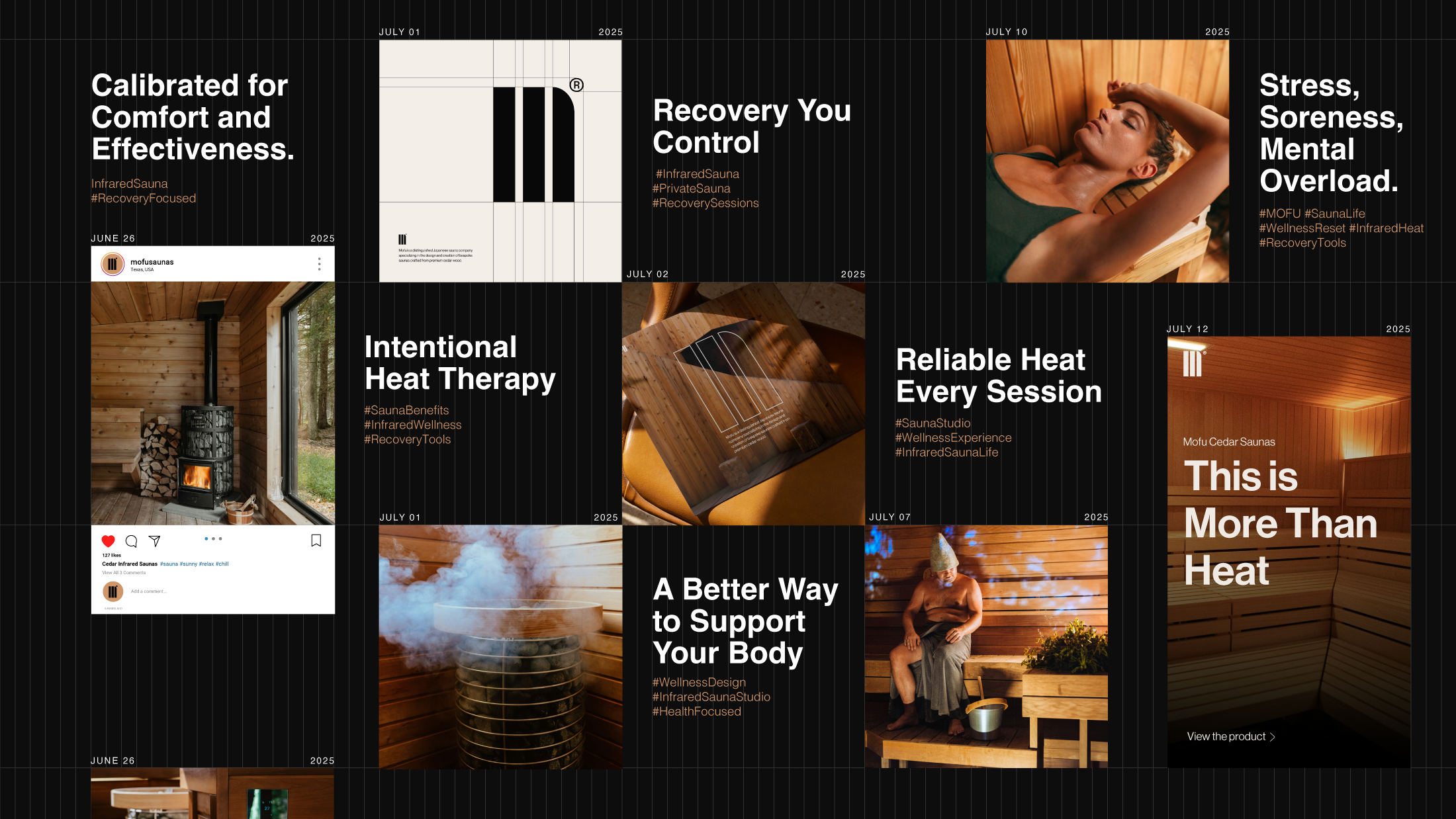
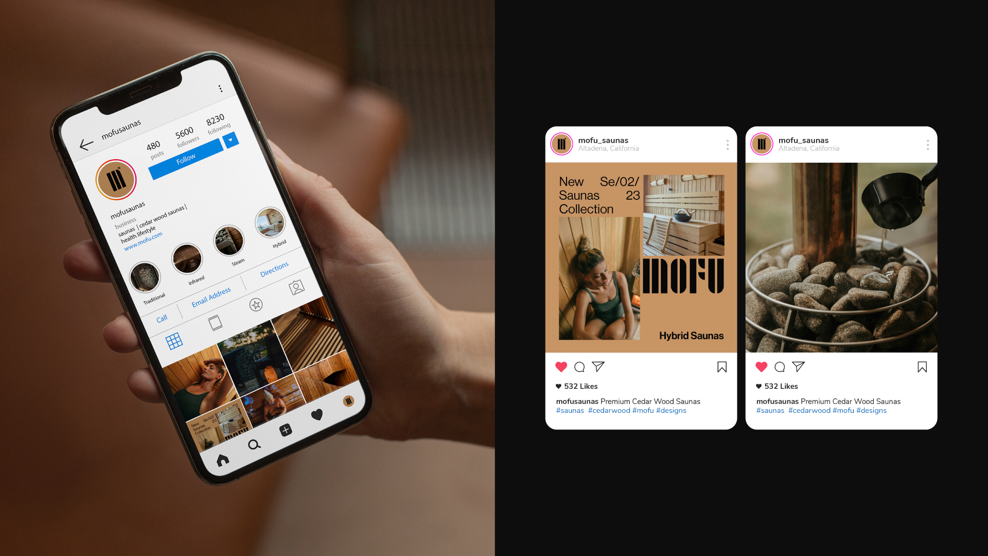
A structured social media system was developed to ensure visual cohesion while allowing flexibility for day to day content. The approach focused on creating modular templates and clear layout principles so every post would feel aligned with the brand without appearing repetitive. The goal was to eliminate visual inconsistency and establish a strong, recognizable presence across all social platforms.
Alongside the design system, a strategic content calendar was defined to organize themes, post categories, and communication pillars. Each type of content was supported by dedicated templates and messaging direction, enabling efficient execution while maintaining consistency. This framework streamlined production, reinforced brand recognition, and provided Mofu with a clear and unified digital presence.
Alongside the design system, a strategic content calendar was defined to organize themes, post categories, and communication pillars. Each type of content was supported by dedicated templates and messaging direction, enabling efficient execution while maintaining consistency. This framework streamlined production, reinforced brand recognition, and provided Mofu with a clear and unified digital presence.
The identity was shaped around simplicity and intention, combining a restrained wordmark with a balanced typographic foundation to create a calm and contemporary base. A nature driven palette and modular grid system introduced structure across every touchpoint, ensuring clarity and consistency without excess. Applied across the website, brand materials, packaging, and social presence, and reinforced by subtle lifestyle imagery and practical mockups, the result is a cohesive visual language that feels thoughtful, functional, and aligned with mofu’s focus on craftsmanship and everyday ritual.