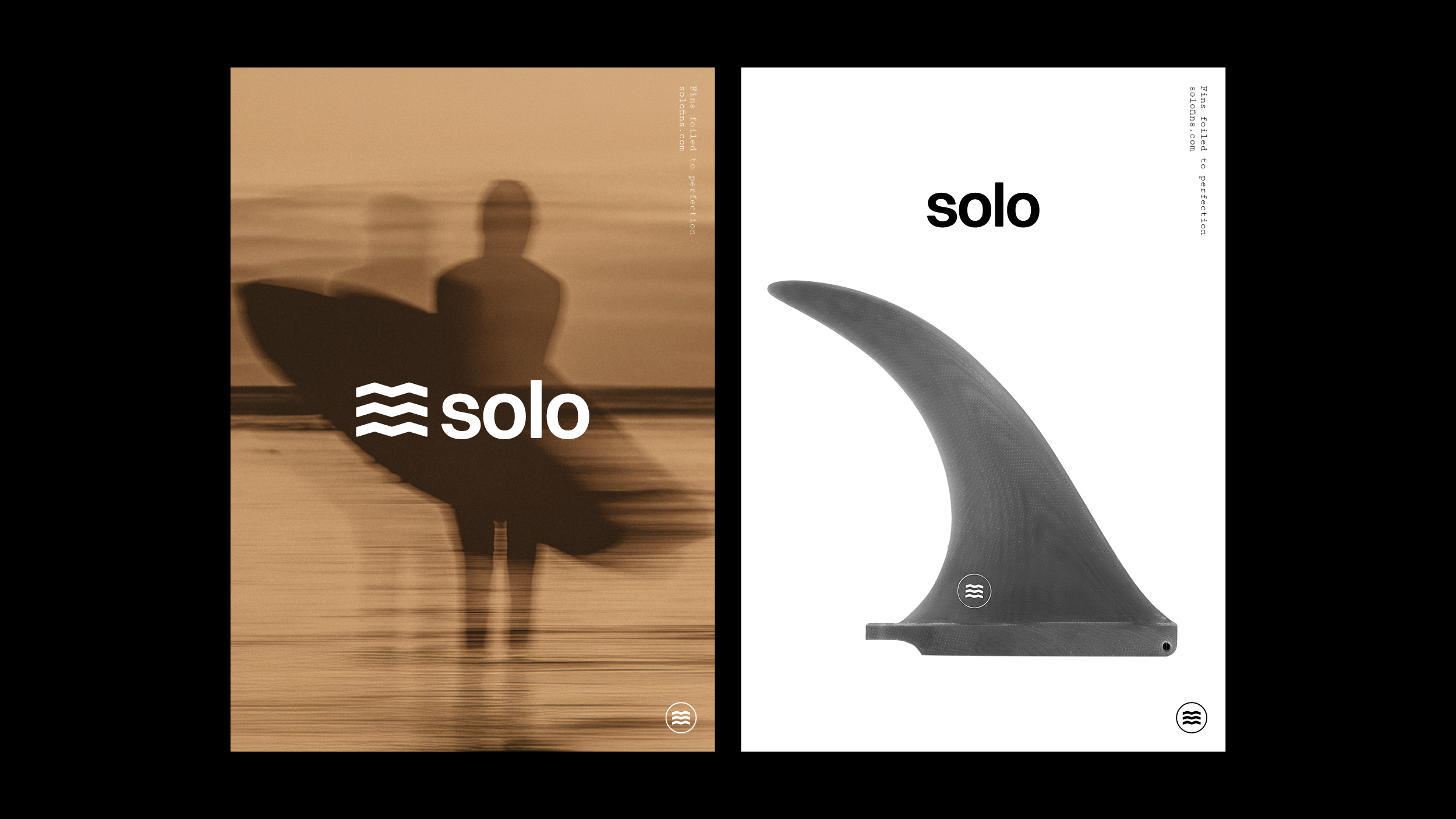
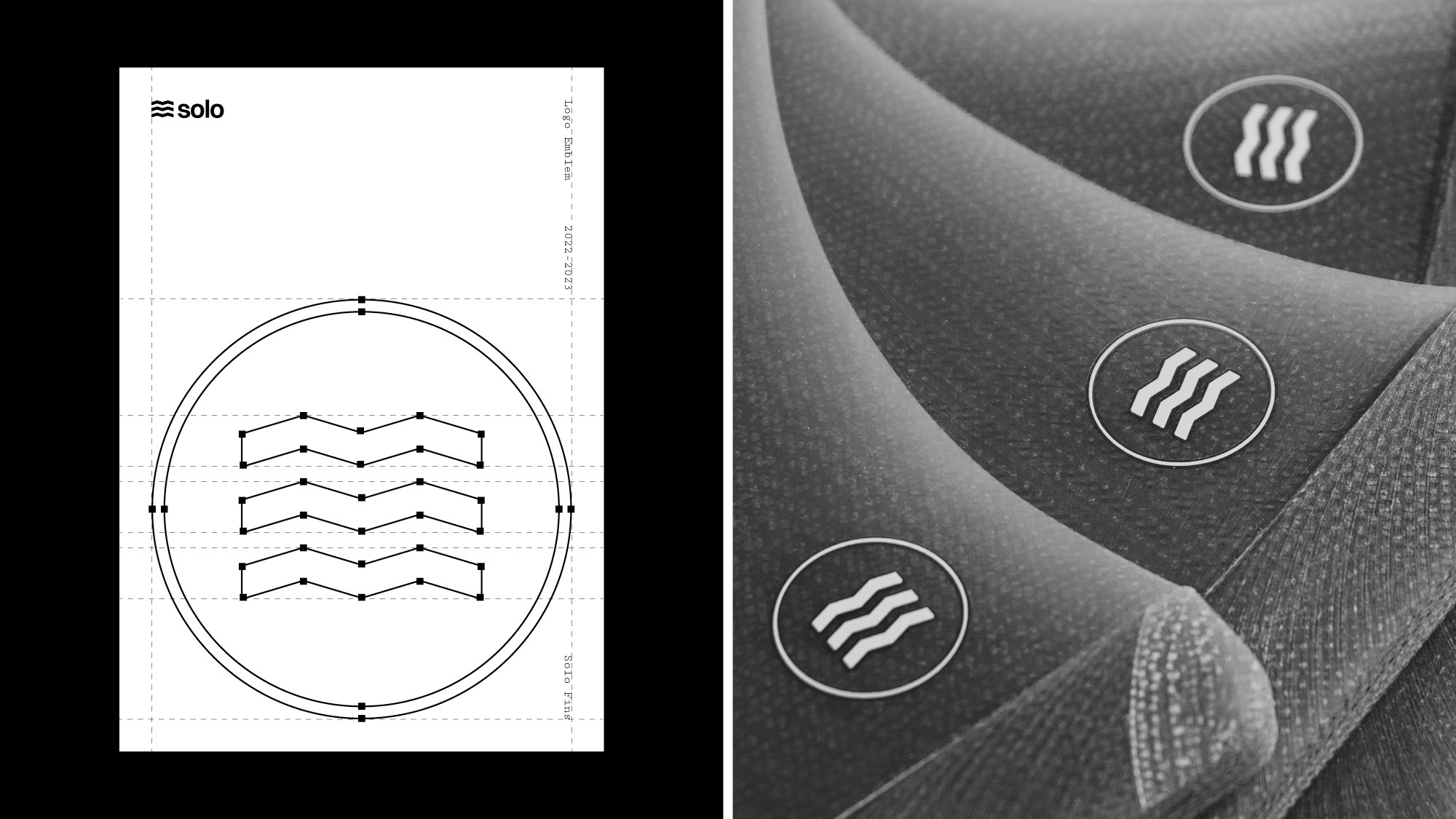
The logo emblem was developed through a deep analysis of waveforms and shapes. Rather than relying on familiar wave symbols commonly used across surf brands, the goal was to explore a new visual approach that felt original and innovative while still being an abstract representation of waves. This led to the study of the A frame wave, a perfectly balanced formation where the wave’s peak breaks downward as its shoulders rise upward, creating a dynamic interplay of opposing forces. Combined with the natural rhythm of wave sets, where waves arrive in sequences rather than isolation, this concept informed the final emblem. The result is a mark that captures visual balance, movement, and rhythm, translating the perfection of rideable waves into a refined and distinctive symbol for the brand.
View Project
This project involved a complete branding and product design initiative for Solo. The scope included logo design, website development, and the creation of supporting print materials. The goal was to visually capture Solo's simplicity and craftmanship, tailored to a niche audience of alternative surf culture enthusiasts.
Problem
Solo needed a brand system that could communicate the uniqueness and level of craftsmanship behind the products, while speaking clearly to a niche surf audience. At the same time, the website needed to be visually refined and expressive, while also supporting a complete and well structured Shopify build capable of handling the brand’s e commerce operations.
Solution
A bold yet minimalist logo emblem was designed to convey a sense of balance and simplicity, aligning with the product’s refined craftsmanship. A custom Shopify-based website was developed to strengthen the brand’s presence while ensuring smooth inventory and product management. Complementary print materials—including signage, packaging, and catalogs—were designed to maintain consistency across all touchpoints and enhance both consumer and retail engagement.

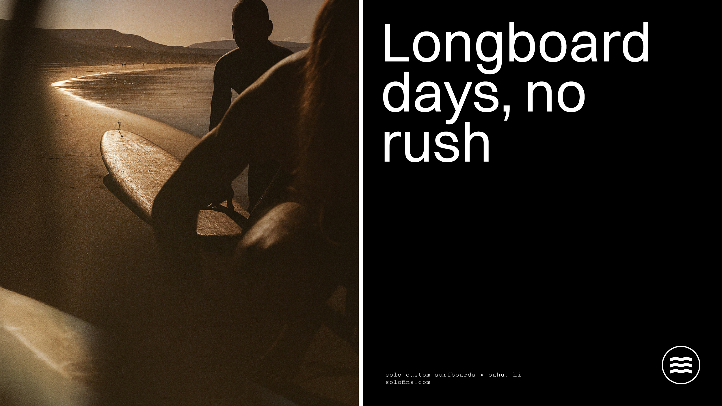
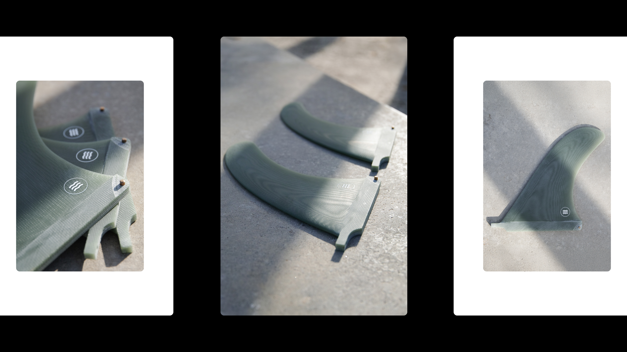
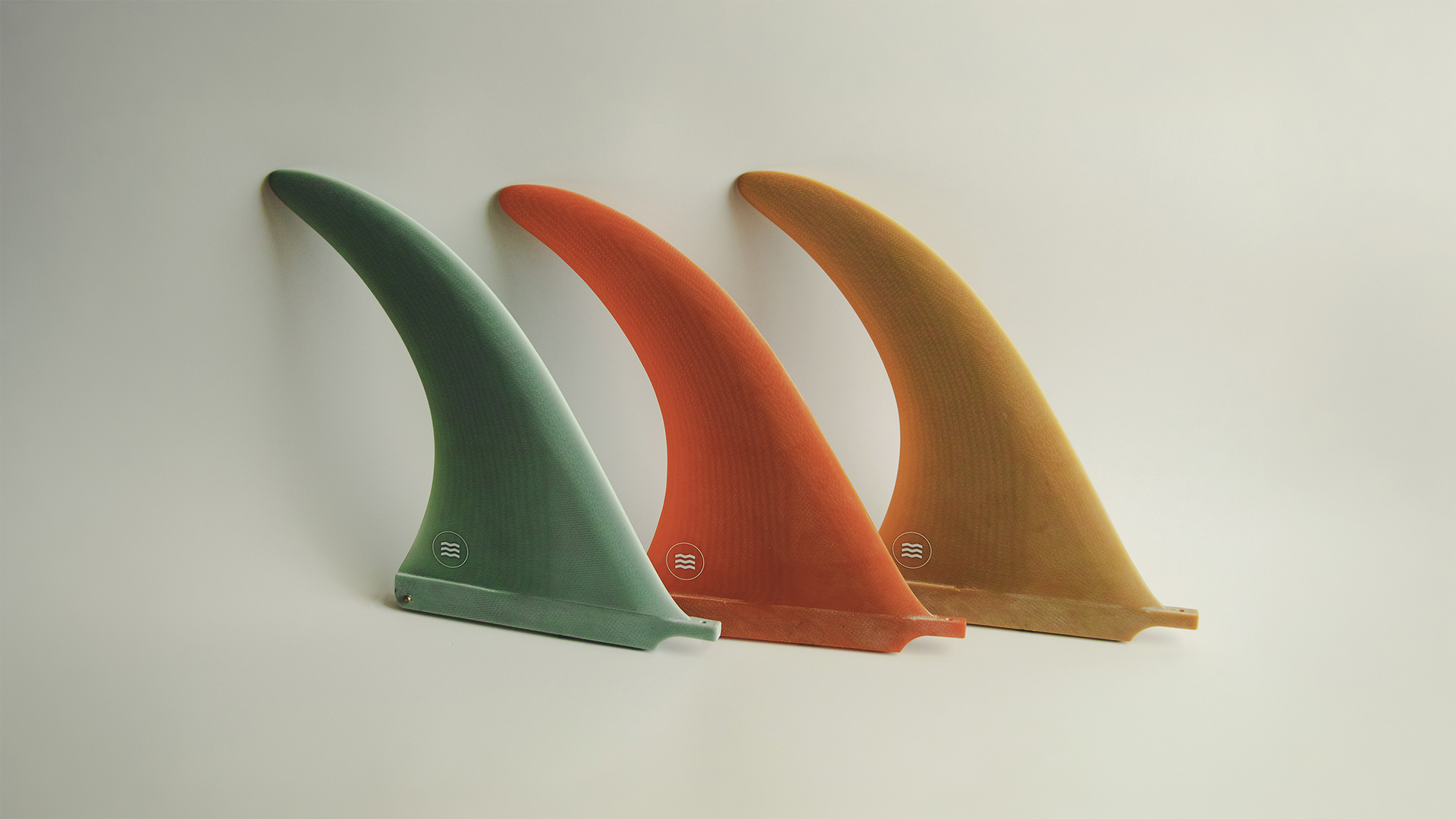
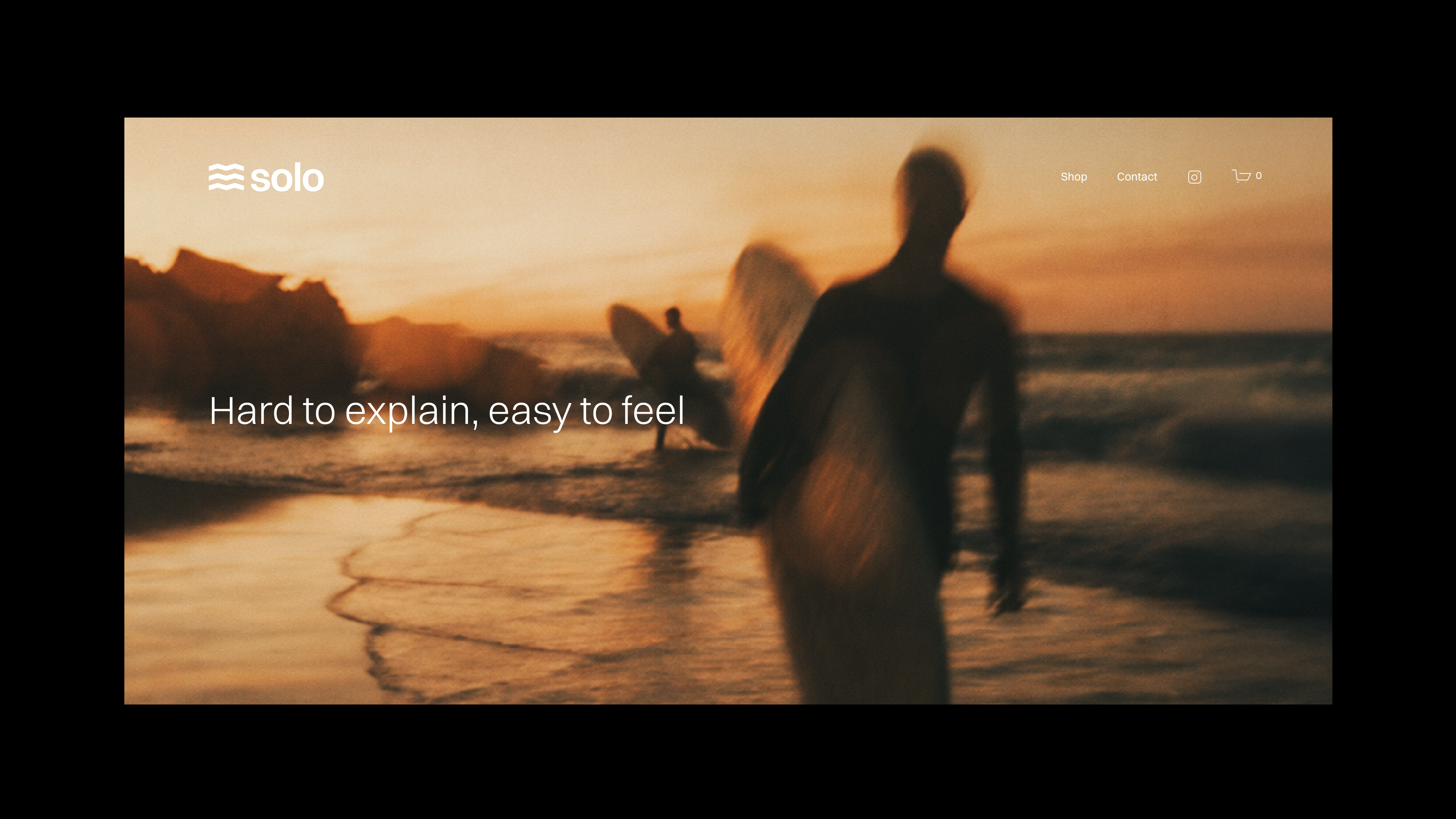
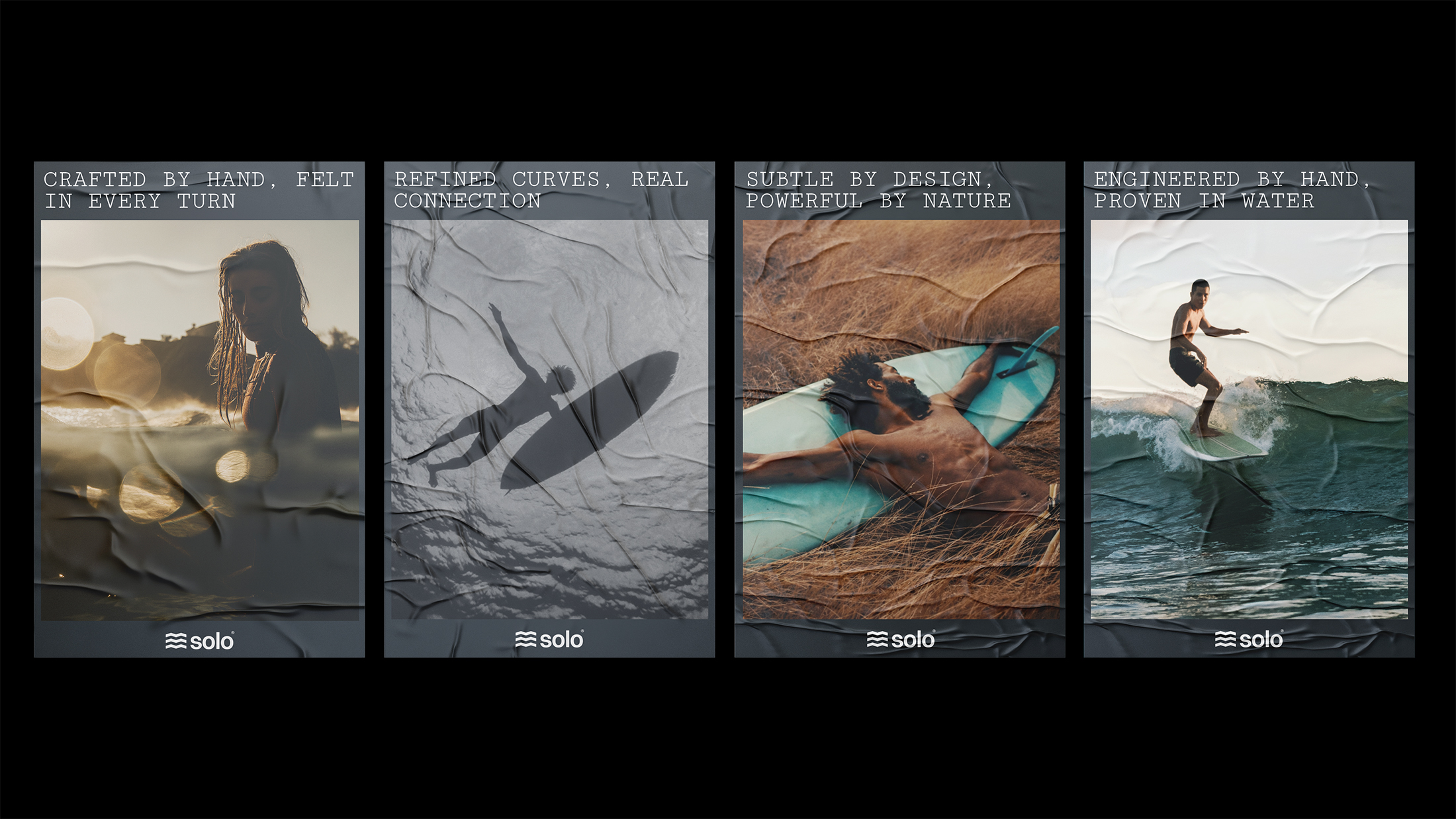
The new website was designed to visually translate the feeling of surfing into a digital experience. Photography played a central role throughout the site, carefully selected to evoke the abstract motion, rhythm, and emotion of being in the water. Alongside this atmospheric layer, the site places strong emphasis on the craftsmanship of the products themselves. A curated collection of detailed product imagery is used across key sections to highlight refinement, materials, and form, allowing the fins to speak for their own quality and precision.
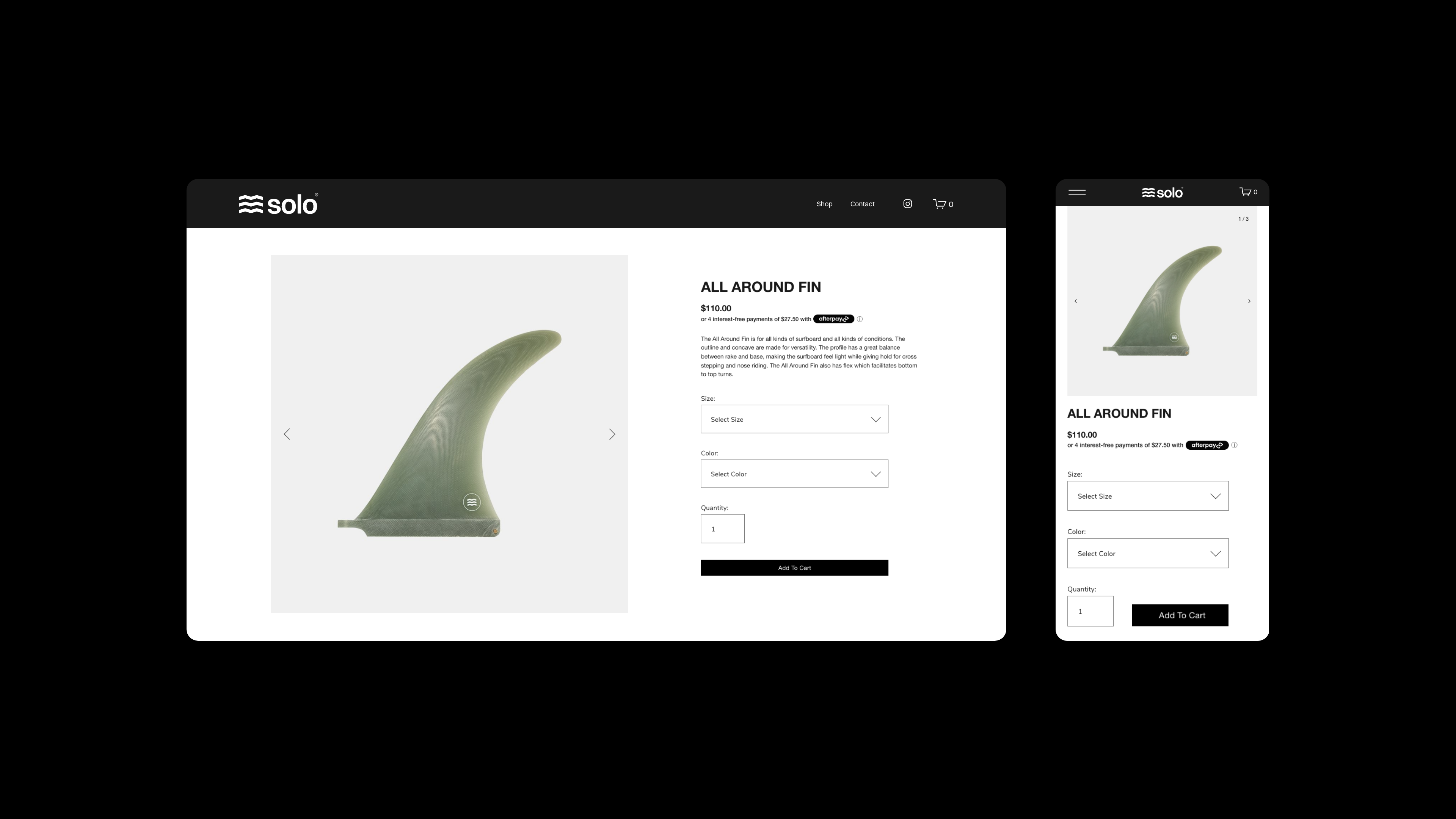
Beyond aesthetics, the website was built as a fully integrated Shopify experience that balanced visual appeal with operational efficiency. The platform was structured to support inventory control, product management, and a seamless connection with the third party logistics provider responsible for shipping and fulfillment. Behind the minimal and expressive interface, the system delivers a precise and reliable e commerce workflow, ensuring that the brand’s digital presence performs as strongly as it looks.
Beyond aesthetics, the website was built as a fully integrated Shopify experience that balanced visual appeal with operational efficiency. The platform was structured to support inventory control, product management, and a seamless connection with the third party logistics provider responsible for shipping and fulfillment. Behind the minimal and expressive interface, the system delivers a precise and reliable e commerce workflow, ensuring that the brand’s digital presence performs as strongly as it looks.
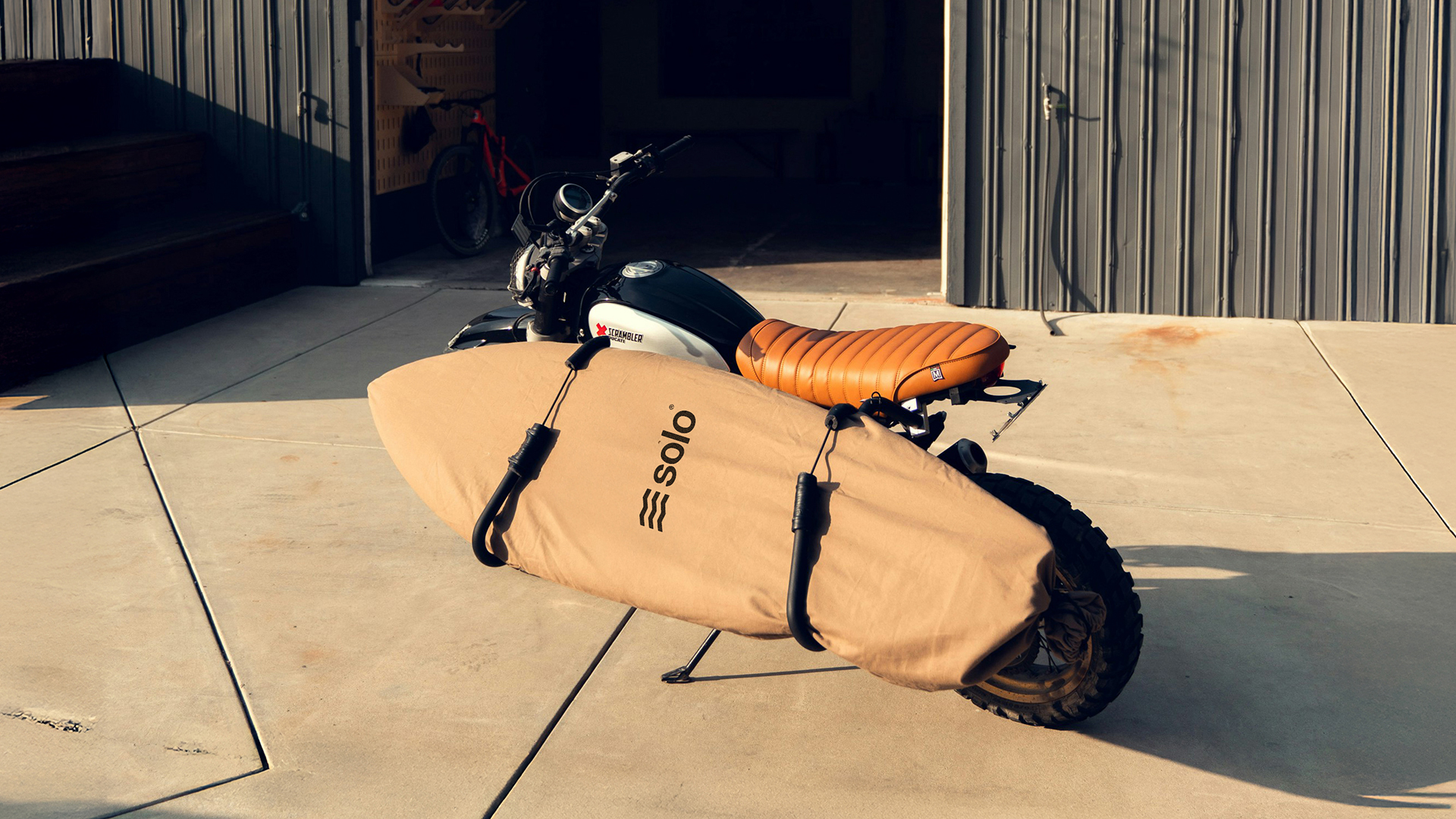
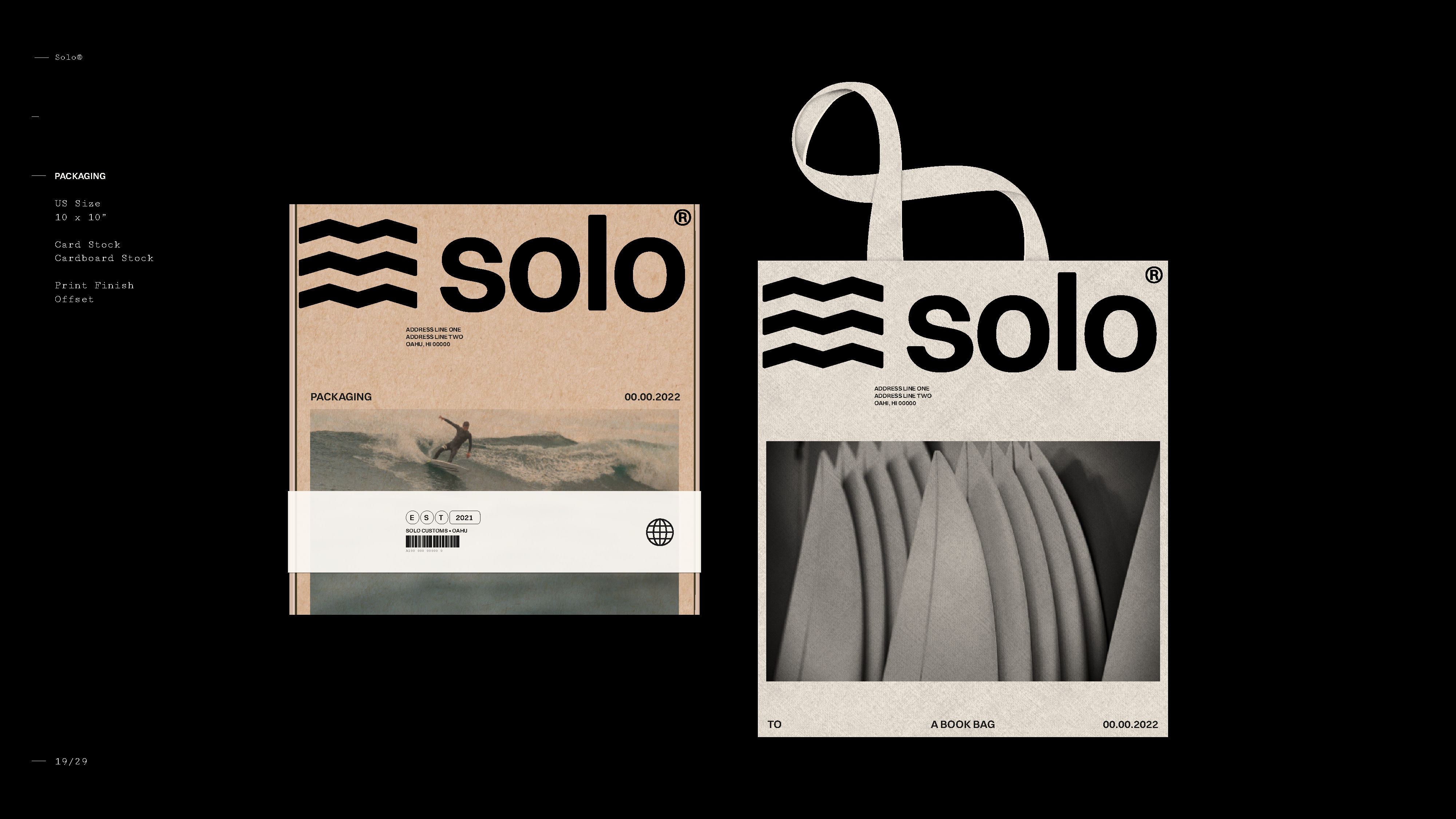
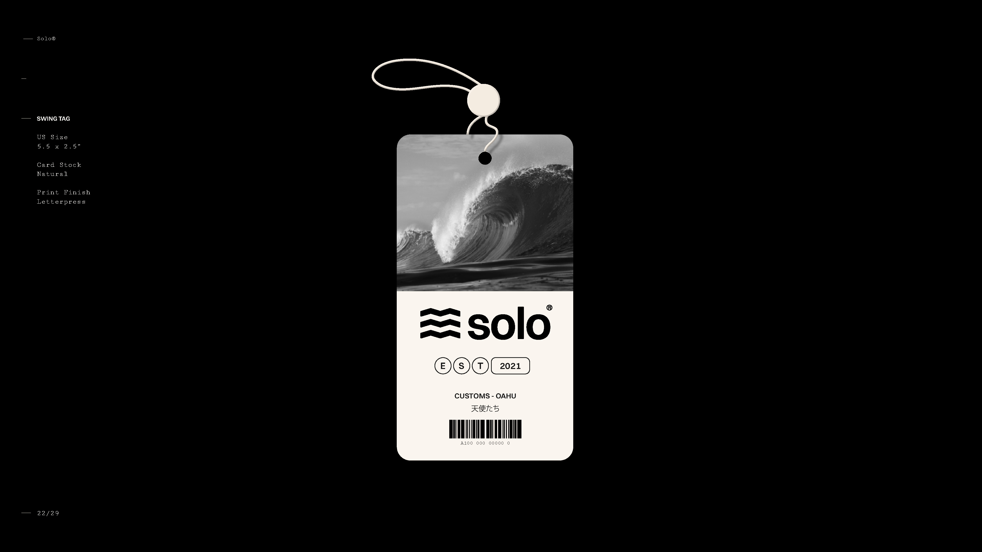
A range of concepts was developed for printed materials to support and extend the brand beyond the digital experience. From tags and packaging to banners and bags, multiple sketches and design directions were explored to provide the client with flexible solutions for their physical touchpoints. These materials were designed to complement the e commerce experience while maintaining visual consistency and reinforcing the brand’s identity across retail and shipping contexts.
The product catalog was designed as a key sales tool to support Solo’s presence in retail stores across the country. Beyond the e commerce platform, the catalog needed to clearly introduce the brand by communicating its visual identity and the audience it speaks to. The opening sections establish context for retailers, providing a clear understanding of the brand’s positioning and ensuring consistency between the digital experience and in store representation.
In addition to brand storytelling, the catalog serves as a functional reference for retailers. Each fin model is presented with detailed technical information, including size specifications and available color options, allowing stores to easily select and place orders. The catalog also outlines Solo’s retail purchasing structure, offering both wholesale and consignment options. Wholesale details include minimum order requirements, while the consignment model supports smaller retailers or those looking to test the product before committing to larger quantities.
In addition to brand storytelling, the catalog serves as a functional reference for retailers. Each fin model is presented with detailed technical information, including size specifications and available color options, allowing stores to easily select and place orders. The catalog also outlines Solo’s retail purchasing structure, offering both wholesale and consignment options. Wholesale details include minimum order requirements, while the consignment model supports smaller retailers or those looking to test the product before committing to larger quantities.