View Project
Ostra is a surf brand dedicated to creating surfboard bags that combine simplicity, durability, and practical functionality. Each product is designed to offer reliable protection with a clean and timeless aesthetic, appealing to surfers who value purpose driven design over conventional styles. The brand’s visual identity reflects a sense of exploration, precision, and modern craftsmanship across both physical products and digital experiences.
Problem
Ostra needed a clear and cohesive visual identity that communicated the core attributes of its surfboard bags. The challenge was to develop a design system that highlighted the product’s durability, simplicity, and functionality while establishing a distinctive presence within the competitive surf industry.
Solution
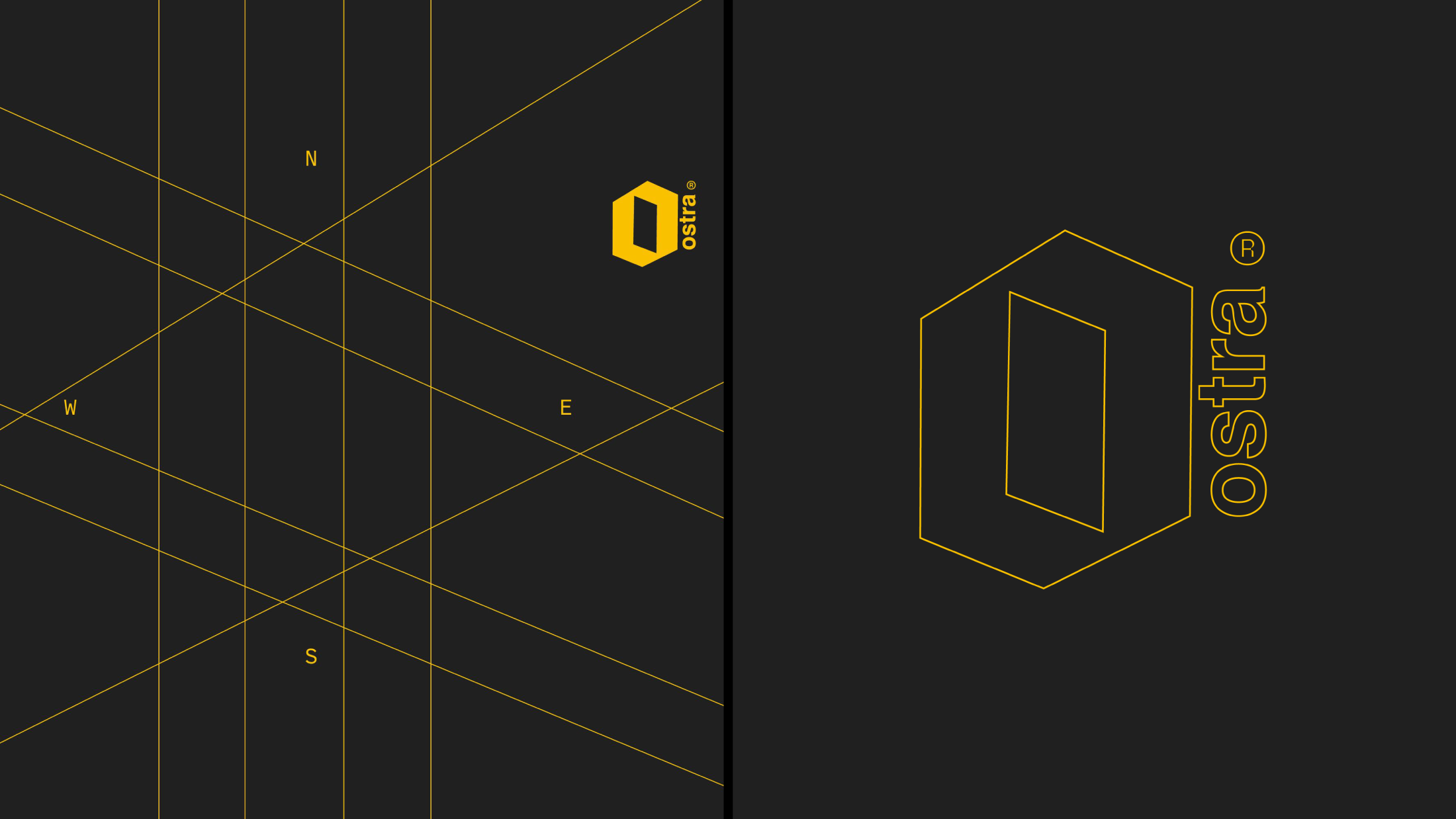
A refined logo emblem was crafted to express the essence of Ostra’s products, incorporating a compass inspired structure to evoke direction, balance, and a sense of journey that aligns with surf culture. This compass grid system became the foundation for the brand’s visual language and was applied consistently across all identity elements.
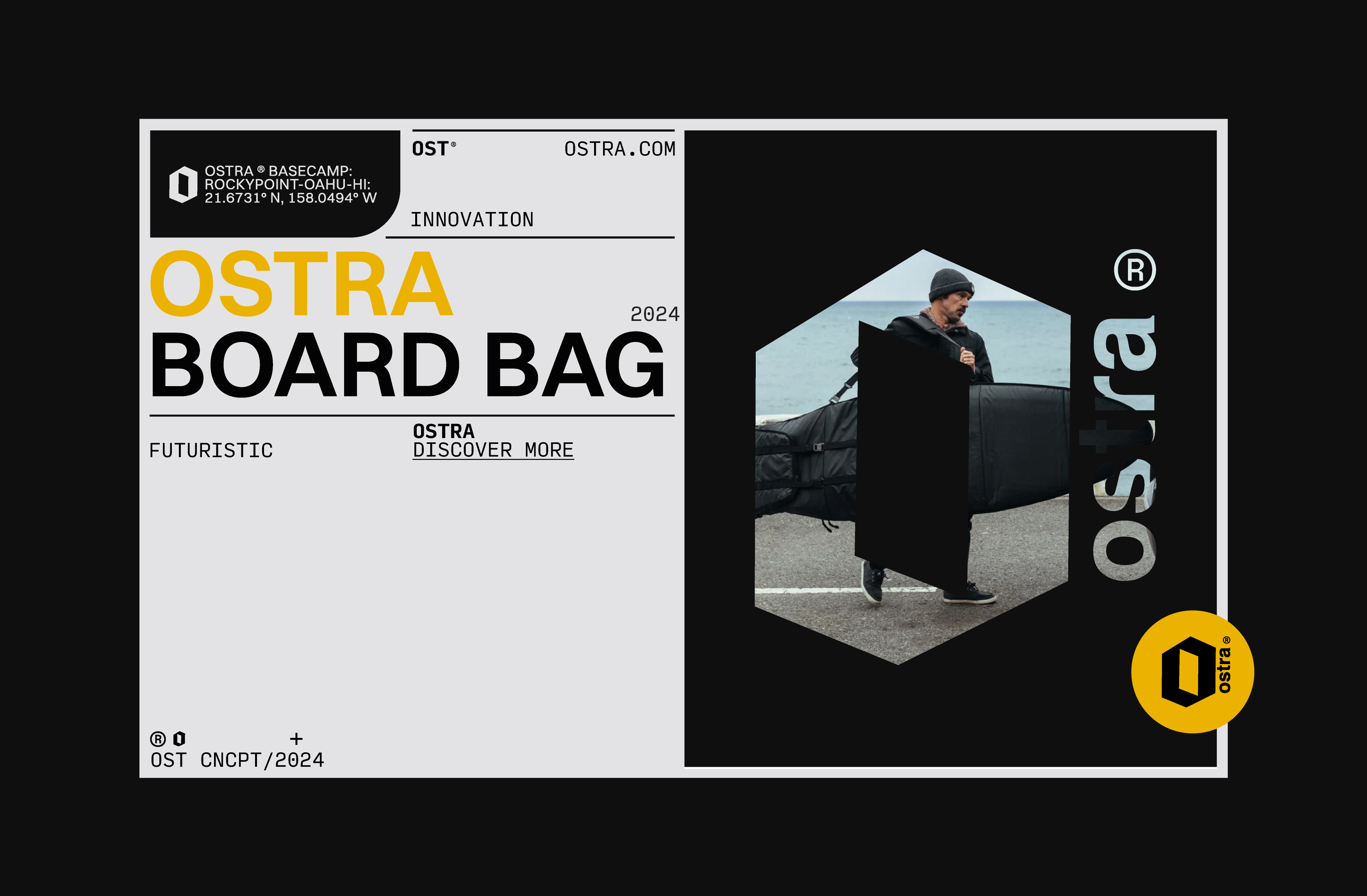
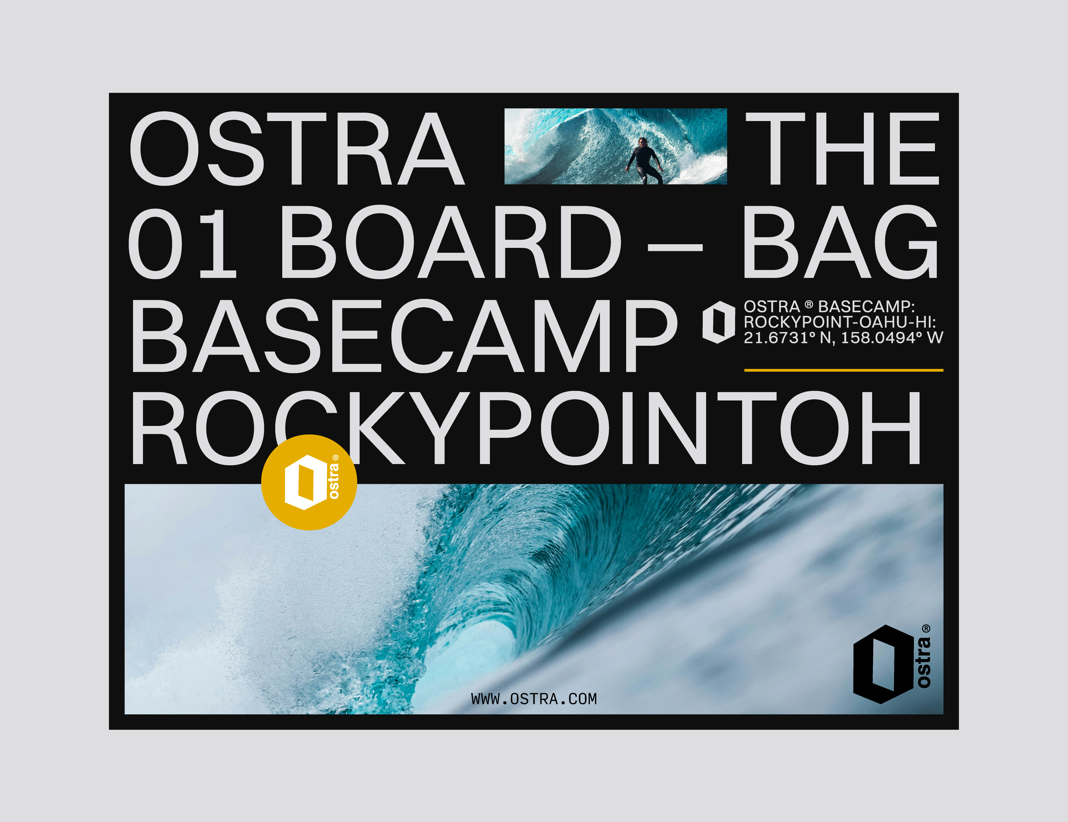
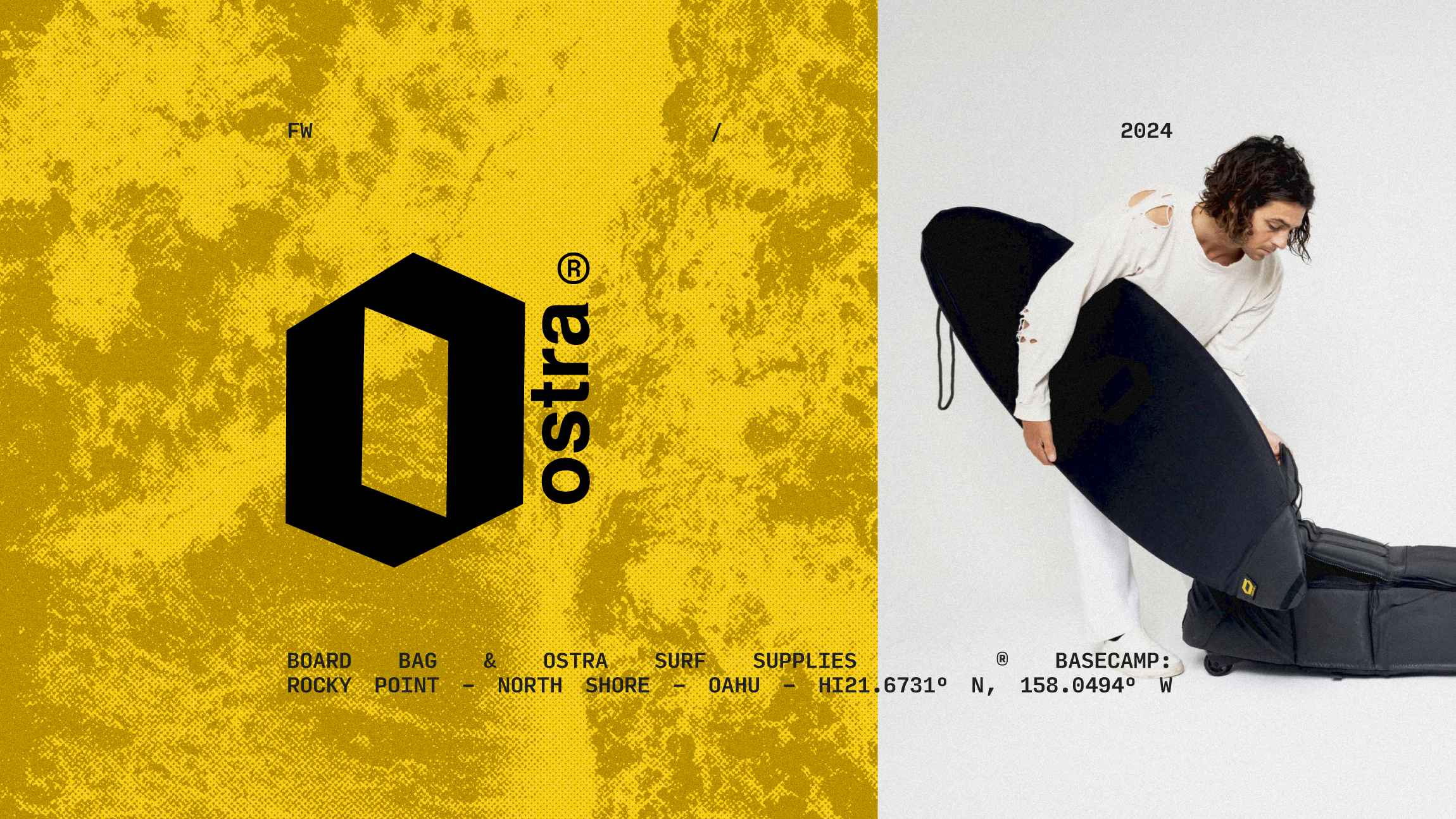
For digital platforms, a user interface art concept was developed using a structured grid composition supported by octagonal clipping masks and minimal bold typography. This approach creates clarity, organization, and a unified aesthetic. The established grid and cohesive color palette ensure consistency throughout every platform and application, reinforcing Ostra’s distinct and functional identity.
For digital platforms, a user interface art concept was developed using a structured grid composition supported by octagonal clipping masks and minimal bold typography. This approach creates clarity, organization, and a unified aesthetic. The established grid and cohesive color palette ensure consistency throughout every platform and application, reinforcing Ostra’s distinct and functional identity.
The visual direction for Ostra was rooted in the language of navigation and movement. Exploration of coordinates, compass orientation, and directional markers such as north, south, east, and west informed the early design studies. Linear compositions inspired by mapping systems and travel routes were translated into graphic elements that reference wind and swell directions. These cues connect directly to surfing, where understanding orientation and reading direction are essential to finding the right conditions.
From this foundation, the logo was developed using structured, parallel line systems that reinforce clarity and direction. The repetition and alignment of these lines create a sense of guidance and forward movement, reflecting the mindset of traveling in search of new waves. The result is a visual identity grounded in precision and orientation, aligned with the brand’s spirit of exploration and discovery.
From this foundation, the logo was developed using structured, parallel line systems that reinforce clarity and direction. The repetition and alignment of these lines create a sense of guidance and forward movement, reflecting the mindset of traveling in search of new waves. The result is a visual identity grounded in precision and orientation, aligned with the brand’s spirit of exploration and discovery.
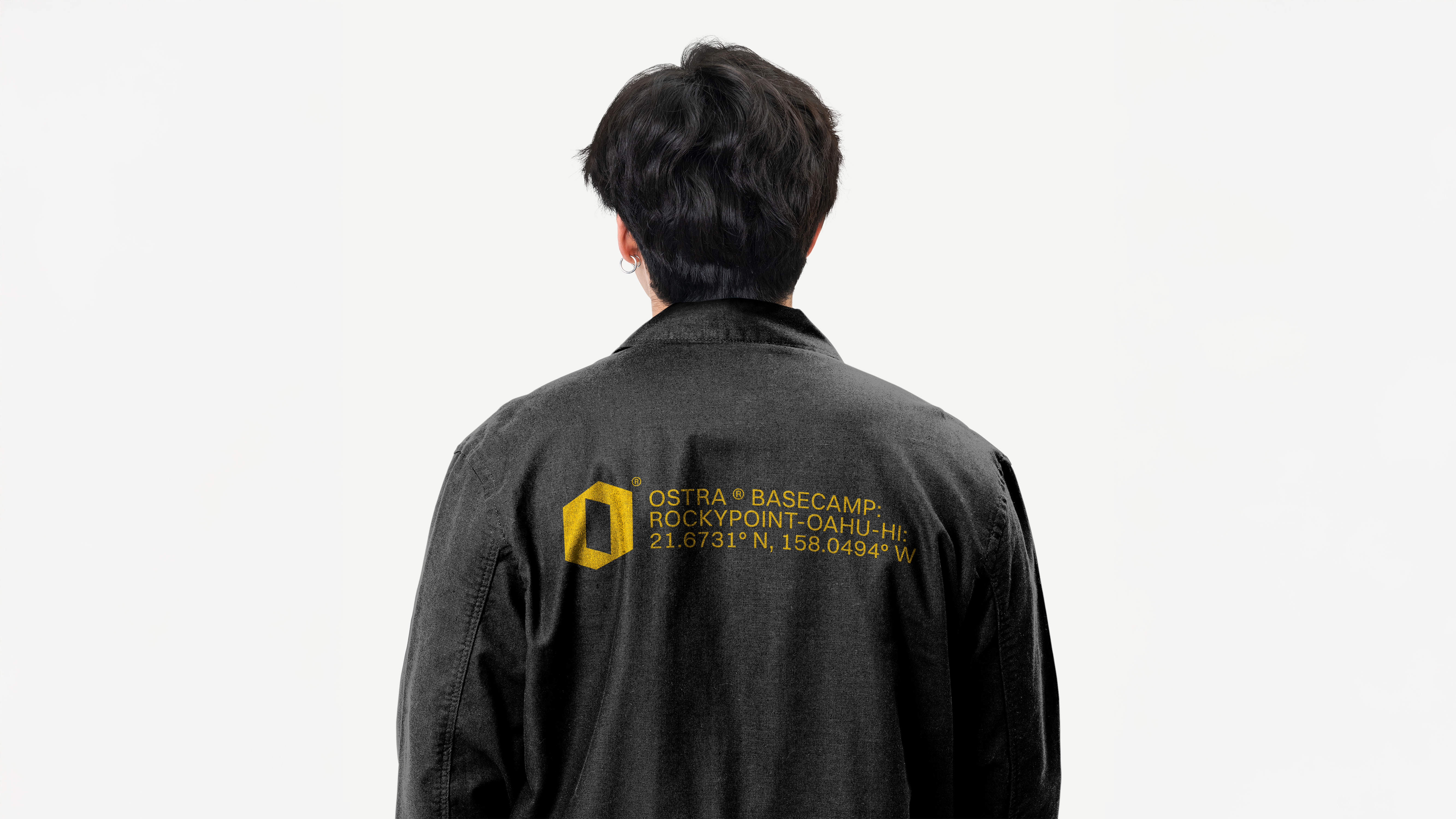
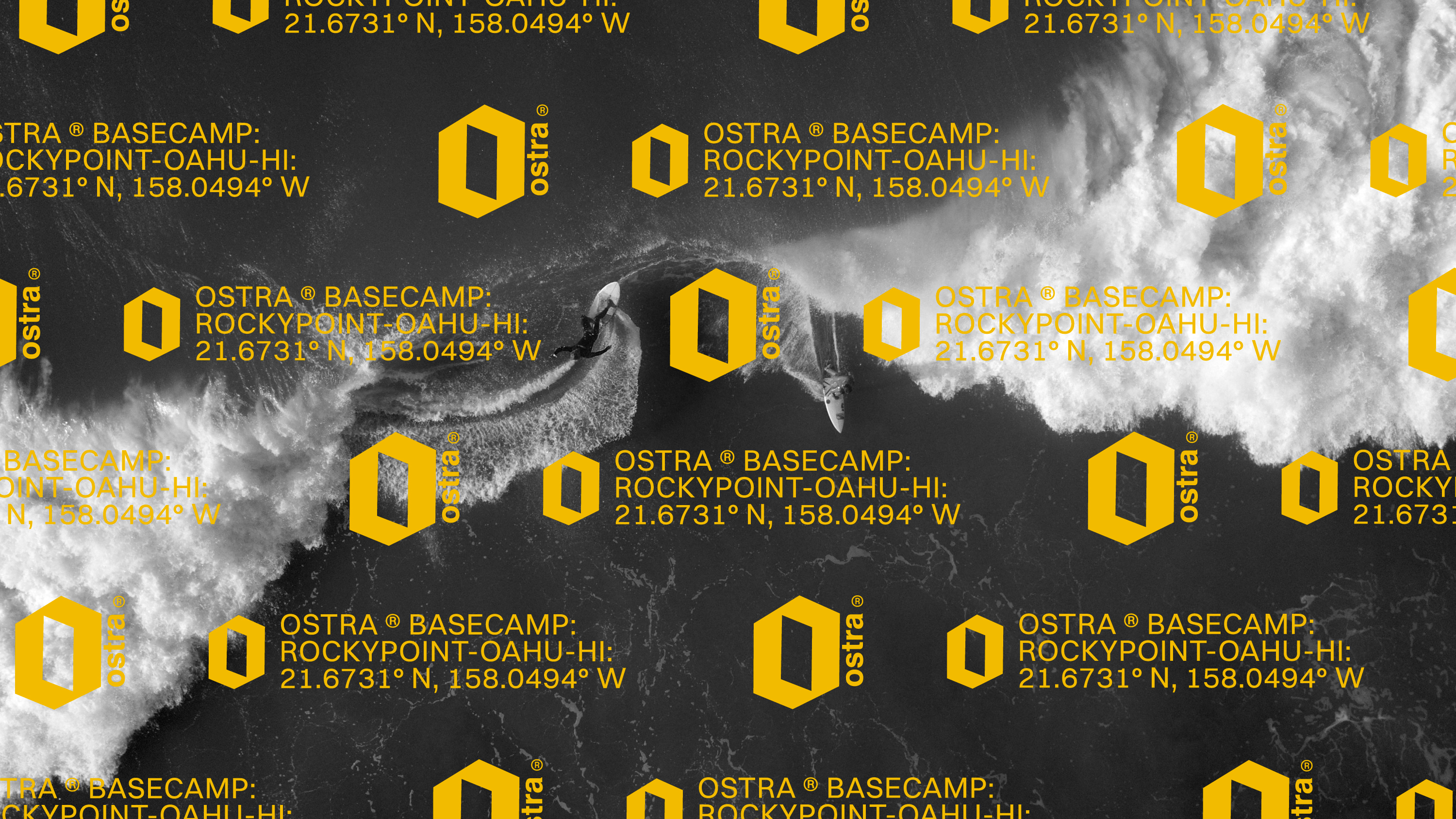
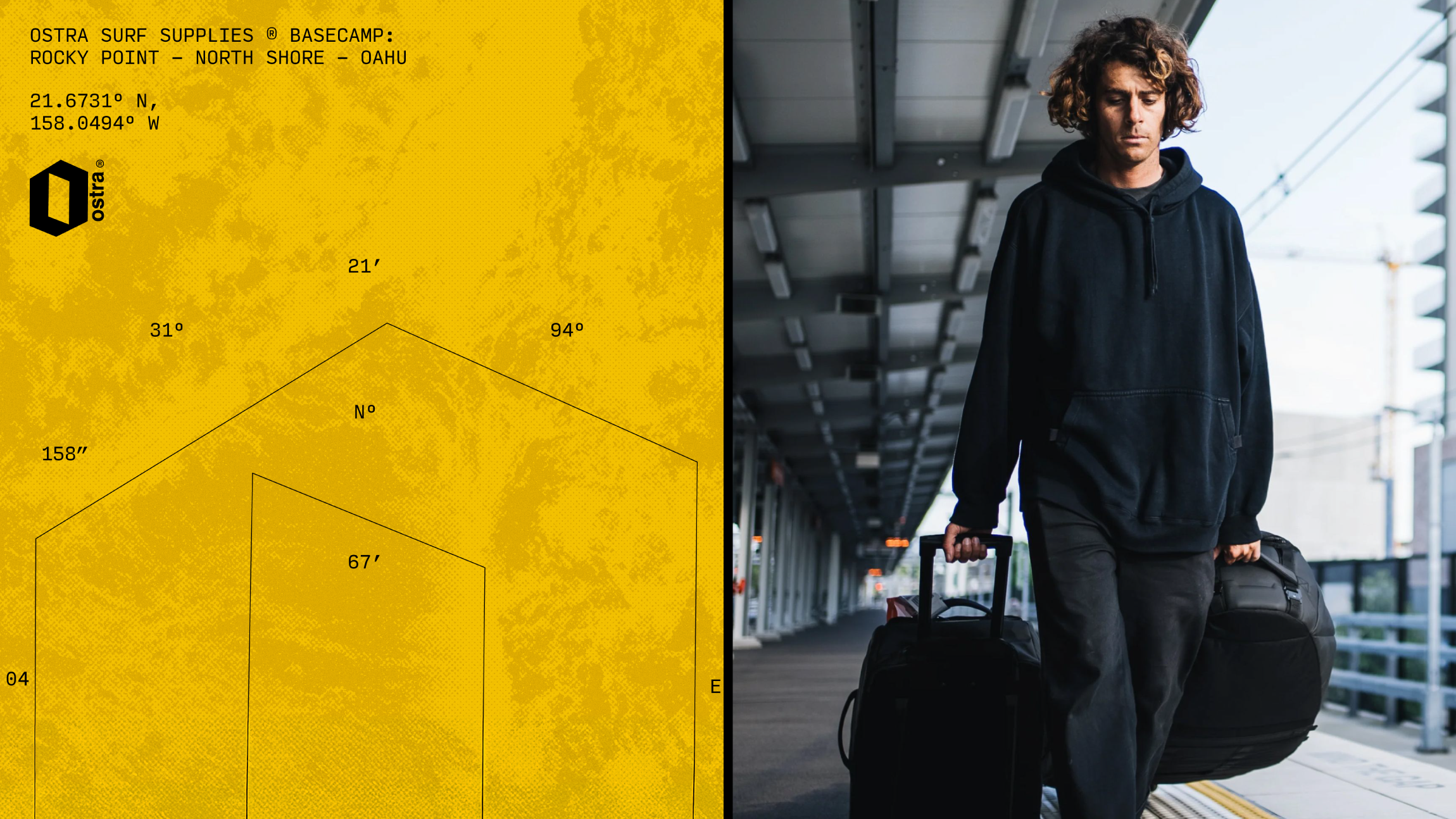
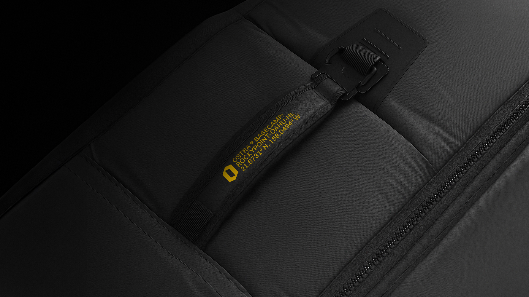
The implementation and prototyping choices were guided by the same navigational and performance driven principles established in the brand foundation. Structured grid systems, oversized typographic hierarchy, coordinate references, and directional markers were applied consistently across packaging, digital layouts, and promotional materials to reinforce clarity and orientation. Mockups and product visuals were treated almost like technical documentation, emphasizing precision, durability, and purpose rather than lifestyle abstraction. This approach ensured that every touchpoint, from web to print, amplified Ostra’s positioning as a travel focused, exploration driven surf brand grounded in movement, direction, and functional design.